Screenshots
Description
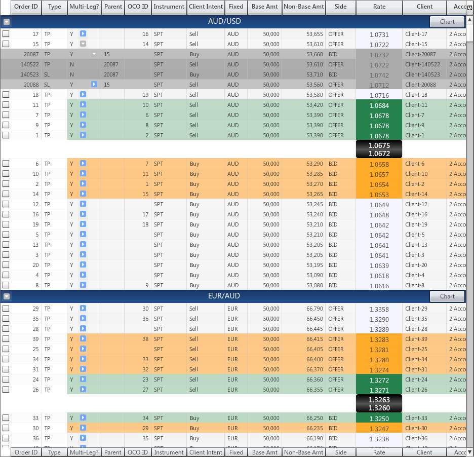
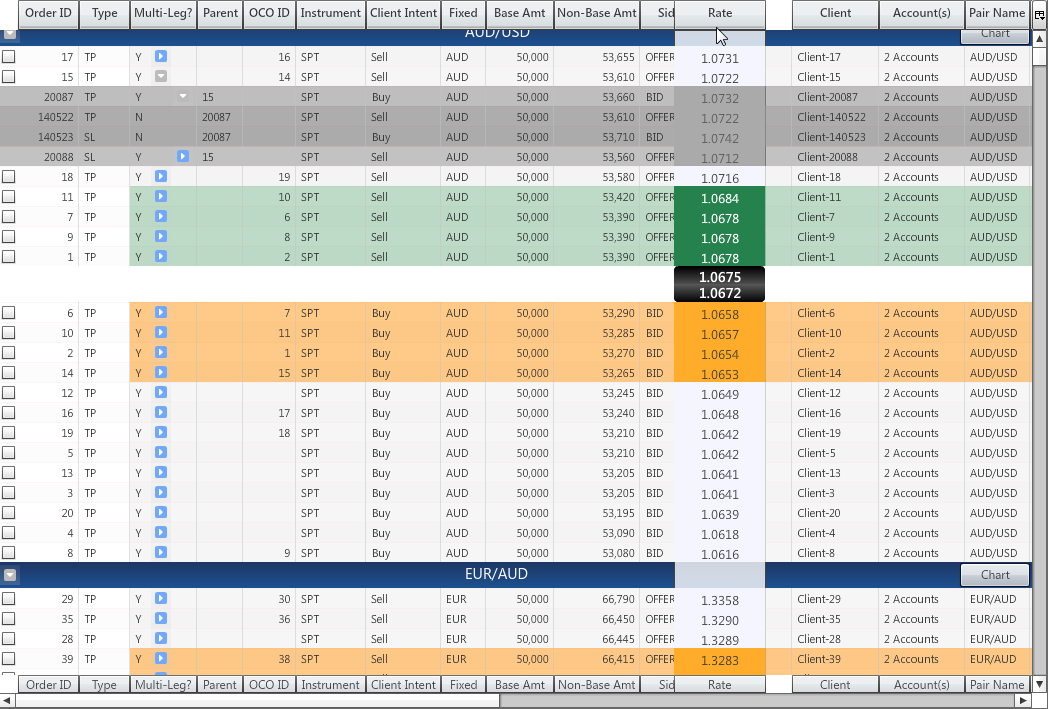
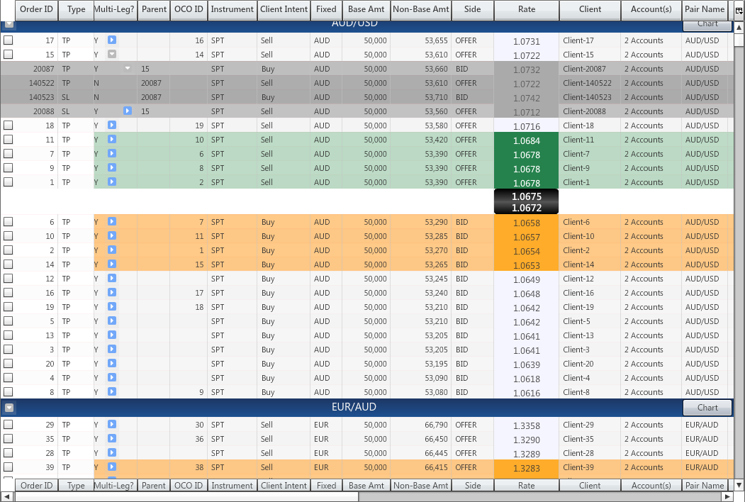
Shows a financial grid of FX orders. The three left-most columns are locked, and all other columns are scrolled using the horizontal scrollbar. The first column uses the built-in selection renderer for selecting individual order.
There are four depths to the hierarchy of the underlying model. Rows at the first depth, the Currency Pair name, are rendered using an column-independent renderer, and have an expansion button to show and hide the orders under the pair. Each order is rendered using the standard column model, while the Buy and Sell price rows only use the layout of the Rate column.
Each order has a number of orders that become active when the order is executed. These can be seen by clicking on the small expansion arrow. As these orders are not active, they cannot be selected, and their row colors are fixed. Each depth is assigned a different row color.
Description
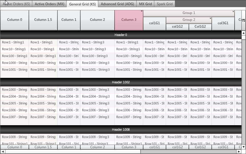
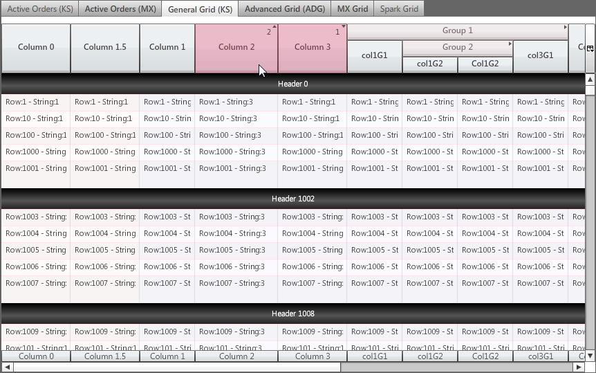
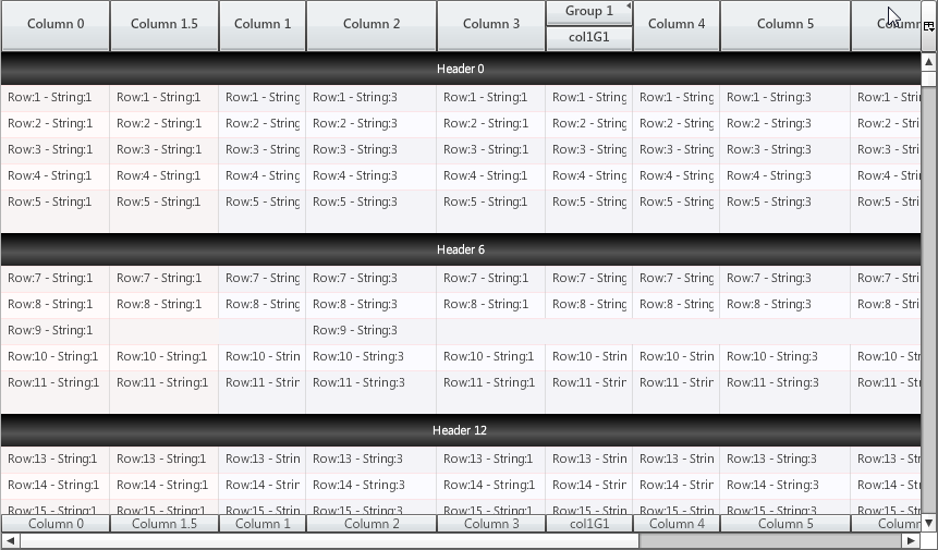
This is from the general grid demo with a simple list data source. Sorting is enabled and active on a single column. Four of the visible columns are organized into two column groups - groups headers are visible in this example.
Both of the groups are 'expandable', and are shown as expanded - denoted by the small expansion arrow on the group header. When the group header is clicked, the group will change to 'summary' mode showing only those group columns the developer has designated as 'summary'.
Description
Shows a simple list data source with sorting defined on two columns. Once more than a single sort column is selected, the sort index is displayed in the column header.
Rows with three different row heights are displayed in this grid. The black 'header' rows have a height of 30 pixels, every sixth row has a height of 38, while the default row height is 24 pixels.
Description
The grid uses live dragging (and live resizing) by default. As a column is moved to left or right, the columns in the underlying table will be shifted. If column grouping is used, columns can be dragged anywhere within the group. Designating a column as 'fixed' disables dragging past that column from either direction.
Dragging is initiated, by default, by clicking and dragging on either the column header or column footer, when visible. Column groups can similarly be dragged by clicking on the group header.
While dragging, the column continues to update its display with changed data.
Description
When a column group is in 'summary' mode - by clicking on the column header - only those columns marked as 'summary' are visible. This allows an arbitrary range of columns to be shown or hidden by the user, enabling the user to focus on relevant information while ensuring secondary information is still available at a mouse click.
Description
Illustrates horizontal and vertical pixel-level scrolling. When scrolling horizontally, if locked columns are used, then the scrolling region will scroll 'under' the locked region.
The range of the vertical scroll bar changes as rows with different heights are displayed. Initially, all rows are assumed to be of default height until rendered. Once displayed, these row heights are kept consistent through all changes to the underlying data source.
If there are other screenshots you'd like to see, let me know.